GATHER, STORE, RE-COMBINE
A HISTORY OF IMAGINATION
PART III
The Imagination Institute
OUR STORY SO FAR… Journey into Imagination, the “Fantasyland of Future World,” is the most popular pavilion in the park. Originally opened on October 1st 1982 with the simultaneously prophetic and fun “Creative Playground of the Future” Image Works then joined 5 days later by the fanciful (albeit trippy) 3D film Magic Journeys, the pavilion was finally “completed” in April of the following year with the opening of the Journey Into Imagination ride. An inherently unique experience that has been largely unduplicated in scope, technological advancement, and eloquence of design, Journey into Imagination truly is the definition of an Instant Classic! In a few short years, the abstract and decidedly psychedelic Magic Journeys would be replaced by a film that, to this day, has been unequaled in collaborative talent. Captain EO becomes the perfect addition to not just the Pavilion, but Future World itself. It is Futuristic, Young, Impressive, and has an Optimistic message – a message that aligns itself perfectly with the goals and vision of the Park. Captain EO and EPCOT are “Here to Change the World!”
Epcot ‘94
(Editor’s Note #1) The twentieth century was a time of extreme changes in pop culture. The changing of each decade saw the rather violent (and some would say artificial) change in entertainment and collective philosophy. What is equally unusual is the consistent distain for those things held most dear from the previous generation. In less than eight years, the spectacular special-effects-heavy Captain EO became perspectively outdated and some of its star players had grown out of favor with the theme park masses. At the same time, EPCOT Center had developed the seemingly undesirable reputation of being the” Experimental Prototype Theme Park for Adults”. To Epcot (and ultimately Walt Disney Company) executives an Adult-oriented theme park was unacceptable as to cut-off the ever lucrative 5 - 24 age demographic. With such a large part of the theme-park-going population seemingly shut-out or off-put by the brand of entertainment available it made good business to diversify the amount of offerings in the now over decade-old futuristic theme park. EPCOT Center, (more specifically Future World) was a park that focused on the not-too-distant future of about 30 years from now. And 30 Years Is a long time for a 5-year-old in the early 1990’s. EPCOT Center’s Futurism was about to give way to Epcot’s here-and-now Discovery Park filled with the newest technologies and trends of today.
Honey, I Started a Franchise
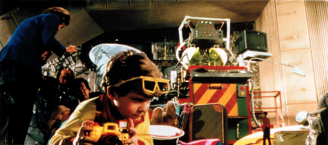
Under Michael Eisner’s direction, the Walt Disney Company became more synergistic than ever before and the line between Film, Television and Theme Parks became more blurred every day. Michael’s previous employment as an executive at Paramount Studios enabled him to revitalize the Walt Disney Studio Productions. (1) As part of this rebirth of Walt Disney Pictures, the High-Concept Light Comedy was reintroduced by films like Honey, I shrunk the Kids released in 1989. Honey, surprisingly became extremely successful. Shortly after its release, the film became a much publicized interactive playground at the then Disney-MGM Studios theme park. The Honey, I shrunk the Kids: Movie Set Adventure opened a little more than a year after the film’s release. The Set capitalized on the film’s unique geography by providing park guests with an experience that closely matched the microscopic adventure taken by the four kids in the film. Although the 1990’s was the “Disney Decade” for theme parks, the Disney films of this decade could have been easily subtitled “Rise of the Sequels”. In a few short years, the success of Honey, I shrunk the Kids lead to the development of Honey, I BLEW-UP the Kid. It is one of those sequels that (in this writer’s opinion) well surpasses the original. (2) This film also had an appropriately huge presence at the young Studios theme park. Many of the film’s over and undersized props were exhibited including the four-foot tall Szalinski house and baby Adam’s six-foot-tall shoe.
The Imagination Institute
As part of the 1994 Renewal, Epcot’s more-child-friend initiative helped pave the way for the eventual replacement of Captain EO with the latest of Wayne Szalinski’s misadventures. The Film itself, was produced rather quickly and was directed by Randal Kleiser who also directed the second Honey, Movie. Tom Fitzgerald said of production “The title said so much that the attraction seemed so obvious but in reality, we had yet to define the concept. The biggest challenge was making you feel that you had shrunk. Before we were given the go-ahead to film, we had to prove that we could make that happen. The other challenge consisted of creating a film that would appear to be a live show. It was important that everything seemed to be filmed in one single scene, and weren’t sure it was going to work! Actually, the film was shot in several sequences, but it doesn’t show. The hardest part was to freeze the actors in certain places and to get them to strike the exact same pose in the same spot to ensure continuity.”
Honey, I shrunk the Audience
An Original Description
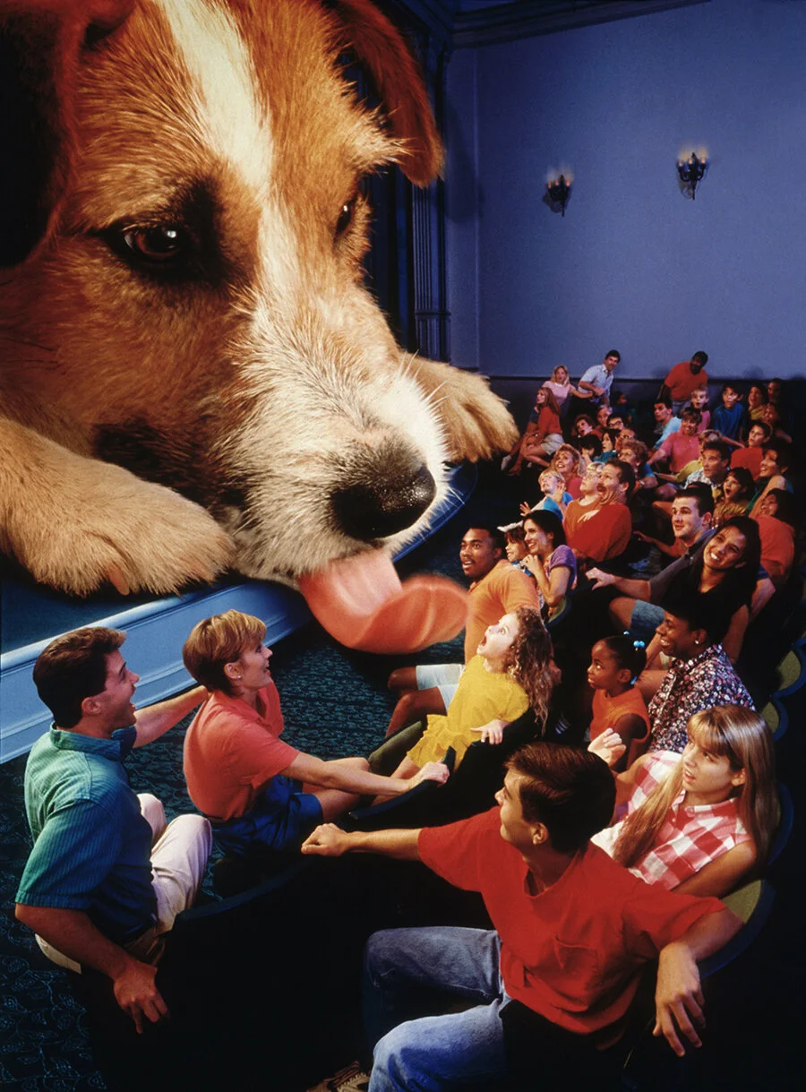
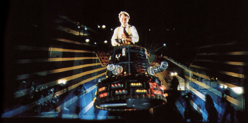
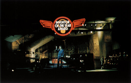
Honey, I shrunk the Audience takes place in the fictional Imagination Institute. As its backstory states, The Imagination Institute was established almost a century ago by founder Reginald Channing and is currently run by his son Nigel Channing. The Institute was created to allow inventors, futurists, artists, and other creative individuals a place to innovate and create. The Imagination Institute is closed to the public excluding a single day in which the Institute holds its annual Inventor of the Year Awards show. And that day is today. Continuing the tradition of past inductees like Thomas Edison and Walt Disney, Wayne Szalinski is to become the next honoree for this year’s presentation. The awards ceremony is lead by Imagination Institute Chairman Dr. Channing. And In typical Honey,… Movie fashion, nothing goes according to plan. Among the many accidents that occur, Wayne Szalinski arrives miniaturized in a hummingbird –like craft. From there, the wild exploits of the Szalinski family continues from one misstep to another, and the entire presentation culminates in have the audience itself being shrunk. After returning the audience to normal size, the show ends with the Szalinski’s dog Quark sneezing all over the audience.
Honey, I shrunk the Audience (or HISTA as its referred to by the cast members, and frequent guests) does feature its fair share of technological advancements, most notably the installation of a rising platform which lifts the entire audience to a maximum height of four inches during several key scenes. The presentation also features several other “4-D Effects” including water sprays and under seat high-pressure air cannons to simulate scurrying mice underfoot.
Approaching Millennium
In the six years between 1993 and 1999 almost every pavilion in Future World was changed. (3) Epcot was gearing-up to throw one of the biggest parties of the century to help ring-in the new millennium. As such, (and for the second time in company history) most executives and Imagineers turned their attention towards the Futuristic Theme Park. This time, it seems apparent that there was an overall drive to complete a near decade old transformation from EPCOT Center to “Epcot – The Discovery Park”. “Century 3” was right around the corner so Horizons was already on its way out. (4) Energy, Spaceship, Motion and The Land had all been changed and even Epcot’s Entrance Plaza was experiencing a dramatic (albeit, controversial) transformation. This left only ONE Pavilion that had not been changed or updated to reflect the Discovery Park’s tone and sensibilities.
The Importance of Flow (Part 2)
Disneyland and The Magic Kingdom are among the most celebrated and effective achievements in the history of Architecture and Urban Planning. They both precisely and completely service the purposes for which they were designed to do, yet for all of their charm and mastery of architecture’s ability to convey narrative and evoke highly specific emotion responses they do have a tenancy to appear overcrowded and even congested on even the most moderate of days. Because of this, EPCOT Center’s designers intentionally made every walkway, avenue, and promenade exceptionally wide. In addition, all pavilions were designed with great concern for crowd-flow. Although Imagination was the only pavilion to integrate flow into its overall storyline, every Future World pavilion incorporated extremely effective traffic flow patterns. (5) The altering of this flow could cause problems, but no one could ever predict just how dramatic the consequences could be under the right (or this case wrong) circumstances…
The Forgotten Journey
( Editor’s Note #2) Few events in the course of theme park history have stirred such strong emotions as those that encircle the Journey into YOUR Imagination attraction. Researching this event has been extremely difficult. There are very few articles, the coverage of the attraction has been stripped from official online archives and even Disney A to Z - The Official Encyclopedia mentions it in title only. The second version of the Imagination ride has joined the ranks of other infamous works such as the Light Magic parade, or Stitch’s Supersonic Celebration all events that both guests and the company would just assume forget.
Death by Queue Rope
"There are three kinds of lies:
Lies, Damned Lies and Statistics."
— Mark Twain
In the 1990’s, just like today, the parks are constantly monitored for everything. In an effort of continuous improvement WDW management, wants to know the movement and behaviors of each and every guest. (6) As such, new concepts, procedures, and policies are created (now almost daily) to either make the guest experience more enjoyable or the business more efficient. So after HISTA opened the decision was made to make the “4D attraction” the main attraction of the Journey Into Imagination Pavilion. This change was accomplished by extending a single white nylon queue rope into the center of the pavilion’s main thoroughfare, suggesting that the film was the primary experience of the pavilion. This simple and seemingly harmless change essentially cut-off the Ride and Image Works from park guests. Almost over-night the numbers for Journey Into Imagination began to drop. For well over a decade Journey was the number two most attended attraction in the park (second only to Spaceship Earth). (7) After restructuring the queue, Journey dropped from number two to number eight. This is really no surprise considering that the attraction is specifically designed to have all people exit the area after watching the film. From the casual visitor’s perspective it doesn’t make sense to perform a U-turn to visit a significantly older (unpublicized) attraction and then go through the trouble to walk upstairs to visit an outdated interactive exhibit.
During the late 1990’s, the Walt Disney Company (thanks to a key executive), was developing a reputation for “not playing well with others”. In addition, the charm and prestige of being a Disney Sponsor was quickly becoming a corporate luxury that many could not afford nor was it as lucrative as it once was. Most recently, the notoriously unreliable and extremely late-coming Test Track strained relations between Disney and GM. Kodak was also growing weary of consistently investing the Imagination pavilion for the name-on-the-door and a substandard VIP lounge. (8) When Kodak voiced their concerns over the decrease in Journey’s Popularity, Disney’s reply was that they could update the attraction, but that it would take a significant contribution of funds for an upgrade. (9) The digital camera era was fastly approaching and Kodak was already facing a financial crisis in a soon-to-be almost filmless world. Nonetheless, they did accept and a pitch was made. At the time, Imagineering was a highly political organization, filled with extremely ambitious and power hungry individuals that cared a lot more about position and prestige than world-class storytelling. As such, Imagination’s creator, Tony Baxter, became a target for multiple reasons. For some, Tony was looked at as “the guy Marc Davis hated” because Tony’s Runaway Mine Car circumvented Marc’s unfinished master piece; Western River Expedition. For most, it was outright jealously of Tony’s position. During this time, it also became a customary practice to undercut a rival Imagineer’s current projects and even better erase their past successes.
This is where Dreamfinder and Figment come in. (Or more accurately do not.) Guest surveys had indicated that the duo had become largely unknown as they were not used in any other medium other than the attraction itself. The new Imagination attraction was pitched as a special effects heavy experience designed to bombard, confuse and challenge your senses. As usual it was also promised to be a “must-see” attraction. As one executive put it… “if you were in that room hearing the pitch you would have been blown away. You'll be in this dark room and not be able to tell up from down. You will be surrounded by sound and not know the direction. It was all amazing, sounded state of the art and more importantly guaranteed to give the guests a terrific experience. We saw this concept art and they spoke so enthusiastically..." One such scene was to feature a fully dimensional set of M.C. Escher Stairs going in every direction. (10) As part of the pitch, it was also stated that because they no longer needed and expositional scene they could forego the troublesome turntable, cut down the ride and create more merchandise space. (11) This very persuasive pitch made by highly skilled politicians (excuse me Imagineers) in which they promised everything including being able to Hear Colors and See Sound. The pitch won-over everyone in the room, and executives from Disney and mostly importantly Kodak green-lit the new attraction.
Turntable Troubles
As was stated previously, Imagination’s turntable is an engineering marvel. But it’s also important to note that its creation is based on the need for and expositional (stationary) scene inside a constantly moving ride system. It worked for the story the original Imagination had to tell. No matter what was to end-up replacing the original Journey, getting rid of the turntable was a going to be a priority. For as Tony Baxter said himself, “because the ride was so darn smart. It was constantly monitoring all of the other vehicles, and if one of the cars decided there wasn’t time and didn’t get to the turntable, then all the other cars would slow down. SO the ride was constantly adjusting itself, which made guest wonder, ‘We just sort of stopped. It is breaking sown? Is there something wrong with the car?’ It was like bad editing in a movie, where you were too long in one scene and didn’t get enough time to see something else. We had no control over that because safety was number one and if that vehicle said it needed to go or needed to stop, that’s what it did.” This is not to say that it didn’t run smoothly from time to time, or that it could not return in the future. But, it is always the goal of both Imagineers and park management to provide reliable attractions for guests to enjoy. At this time, Imagination’s turntable does not qualify for that criterion.
Imagineering YOUR Imagination
In order to fully understand the development of any attraction, one must consider the show producer involved and more specifically their prior projects. YOUR Imagination was Show Produced by Orrin Shively. The same Show Producer of Test Track. (12) Knowing this, it becomes exceptionally simple to understand the resulting attraction. Test Track has been a huge guest satisfier for a number of years because of a single ride element; the high-speed victory lap. If this one element was removed from the picture the attraction would go the way of Disneyland’s Rocket Rods. Test Track’s entire experience is completely dependent on the thrill-ride angle. The overall show for attraction is (to put it delicately) Minimalist and subsequently so is the overall experience of YOUR Imagination. From a story perspective, the two attractions are almost completely identical. Both involve tours of seemingly benign facilities where the hosts (or narrators) give you play-by-play preemptive descriptions of every key event experienced in the attraction. Not-so-ironically, both attractions also end in with surprising finale. The crucial difference here is the outcome and reaction to the two scenes. With Test Track you know what’s coming and therefore are pleasantly shocked with a fake barrier test that becomes the victory lap. In YOUR Imagination the exploding brain scan is completely unexpected and usually frightens its target audience of young children.
Time, is an important factor with every Imagineering project. Historically, there was a direct relationship between the length of development and the overall quality of the product. (13) In modern times, development is typically between three to seven years depending on the size and scope of the project. From all accounts, the development and execution of YOUR Imagination took less than two years. Remember, the original Journey took six months just to define the concept of imagination let alone the whole ride philosophy and structure. (14) Another key ingredient is experience or, in this case, a lack of. The imagineers that developed the attraction came from and era were new technologies served as the basis for telling story rather than other way around. (15) It is also important to note that Imagination is really the last attraction to fall under the “gut-everything-and-start-over” philosophy of refurbishments and architecture. Soon after this, Imagineering would evolve into an “enhance-and-continue-what’s-there” ideology. The latter philosophy shift would help control costs and appease traditionalists as well. But for now, the complete overhaul of sets and structure only further added and already less than adequate budget. The budget of any attraction is the most important factor in its overall success. With a few exceptions, the larger the budget the better the attraction will be. Imagineering thrives on blue sky budgets and logistical challenges. The former gives the designers carte blanche to create some truly wonderful things. The latter stretches the mind be finding solutions to problems that didn’t even exist before the design process began. In the case of YOUR Imagination, the project was produced during the final years of the Eisner administration. At this time, the bottom line was everything and a project’s success or failure was determined strictly by how on-time and on-budget it was.
To be fair, the time factor is probably the biggest one when determining the exact causes of YOUR Imagination’s end result. If you look at the dates, it becomes apparent that every phase of this attraction’s development was rushed. Lest we forget, these are not the days of the 1964 World’s Fair when Walt would start a project and nine months later deliver the end result. In addition, today’s audience would simply not accept the simplistic and childlike arts and crafts approach without a heavy dose of historical license. (16) With exactly 356 days between closing the original ride and opening the new one, there was very little time to plan and construct the new system. When you take into account the removal of the old scenery, reconfiguring of the ride track, construction of new props, reprogramming the ride system, composing a new ride score and installing it, as well new film and video production it’s pretty astonishing what they were able to do in the very little provided. The following description was produced for the spring 2000 issue of the Disney Magazine…
Journey Into YOUR Imagination
Described by
Deborah Way
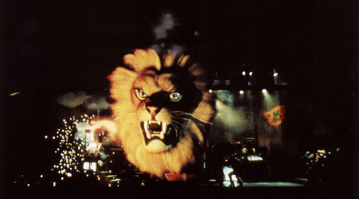
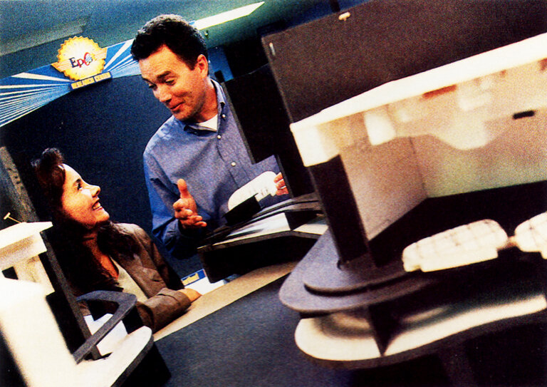
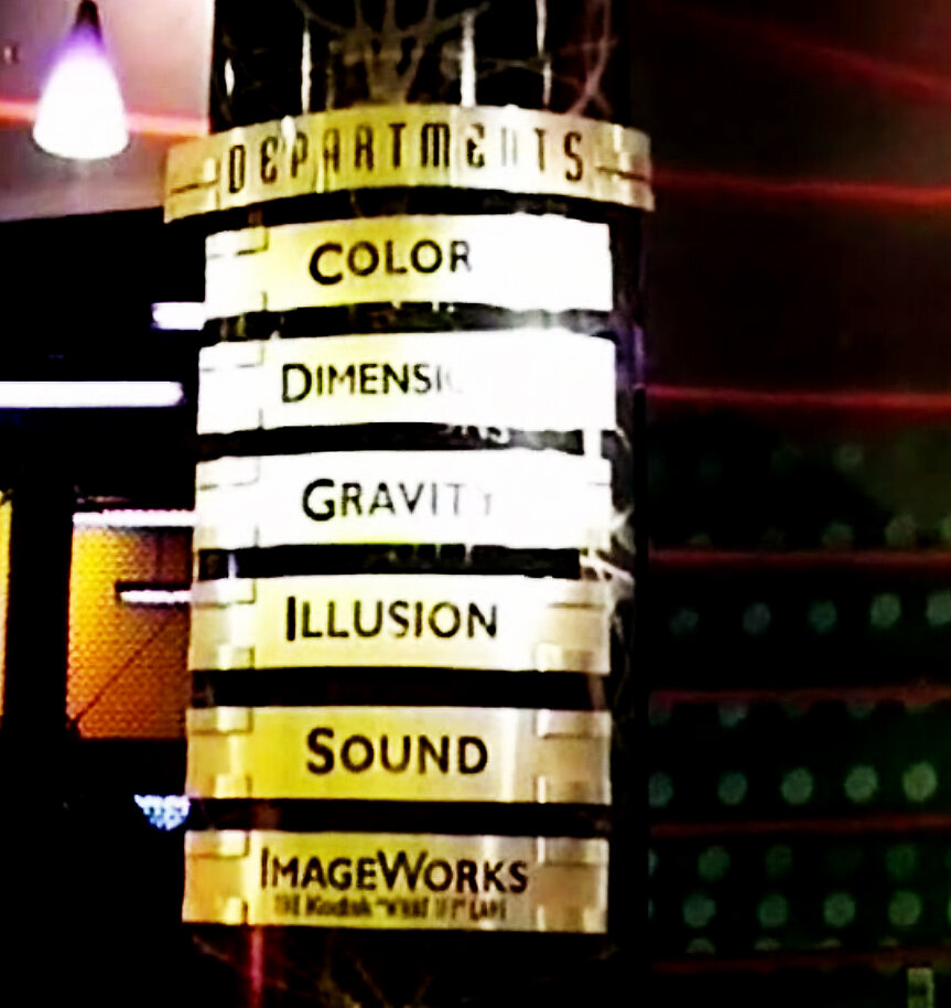
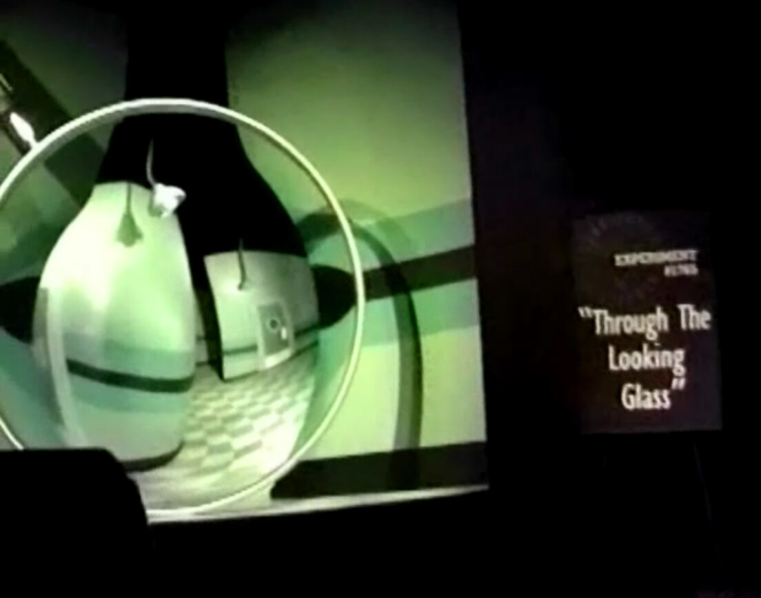
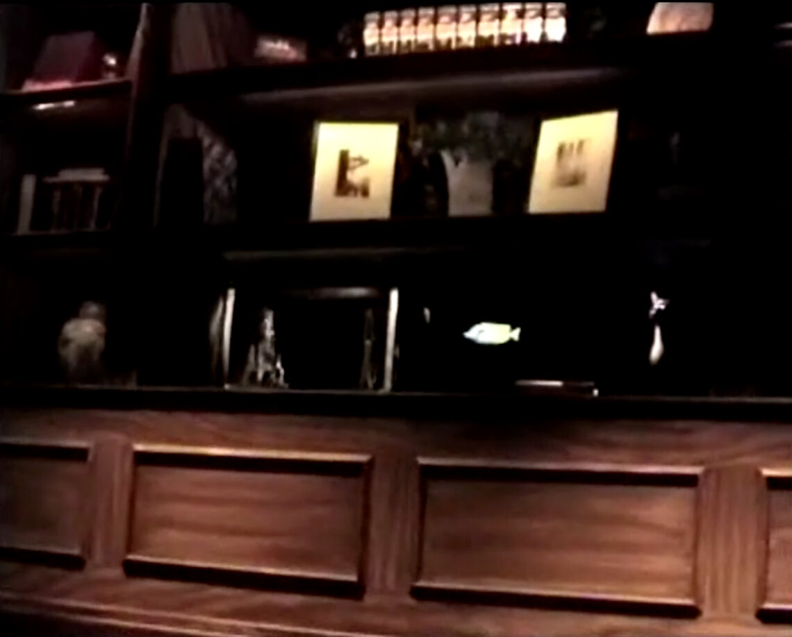
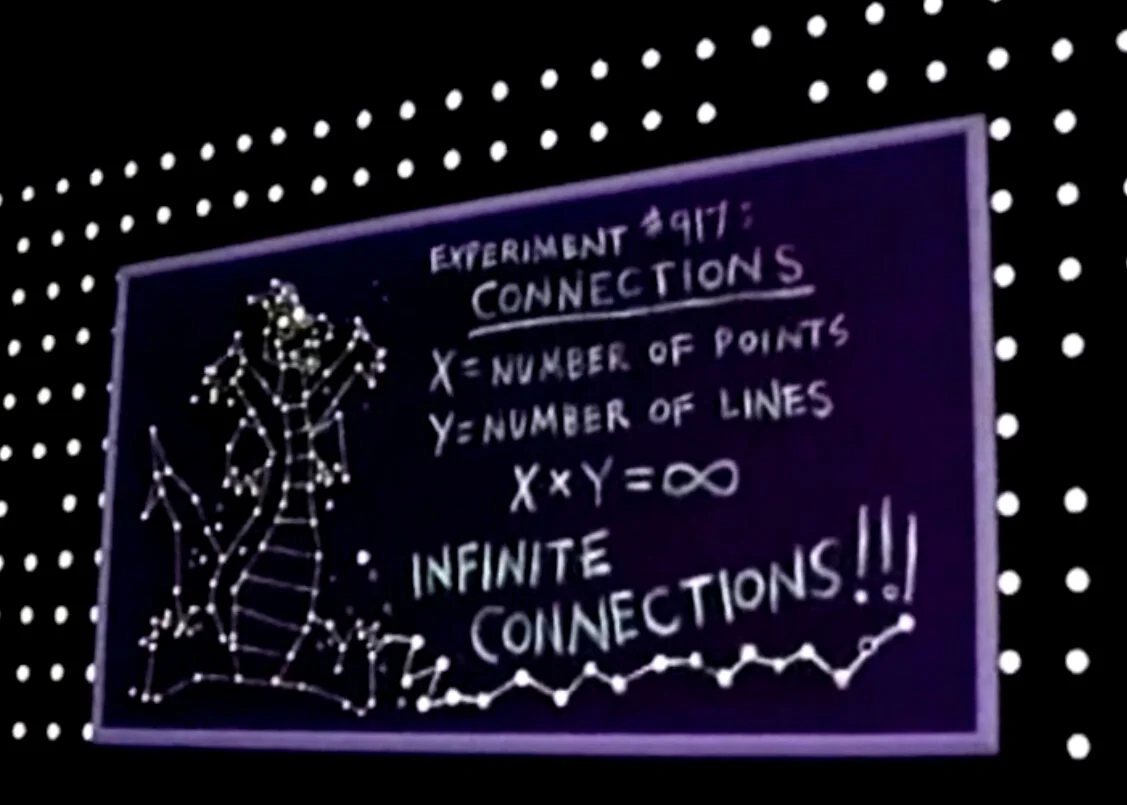
NEED A NEW IMAGE? Then head to Epcot’s Kodak Imagination! Pavilion, where the Journey Into Your Imagination ride and the new Image Works, the Kodak “What If” labs, join a guest favorite, Honey, I shrunk the Audience. What’s new about it? You are, by being inserted right into the action in an attraction that aims to teach you how to “color outside the borders of your mind.” The premise is that riders are volunteers at the Imagination Institute’s Open House, taking part in a series of perceptional experiments on how color, dimension, gravity, illusion, and sound affect the imagination. Your host is the energetic but somewhat clumsy Dr. Nigel Channing, played by Eric Idle, in a reprise of his Honey, I shrunk the Audience role as Chairman of the Institute. Kids will be happy to learn that Figment, the flying purple dragon from the original Journey Into Imagination, is still on hand to help. In your vehicle you’ll pass before the Imagination Scanner, which reveals cobwebs, and “Vacancy” signs. “Perfect subjects, “Dr. Channing enthuses, but you won’t stay blank for long, because your senses are about to be challenged to the max. Is that a train coming toward you in the dark? Is the butterfly cage empty or full? Don’t’ answer too fast – your perception may change within seconds. In the gravity lab, water from a leaky tub drips up, and you’ll learn that each sound has its own color. After a series of such exercises, the Imagination Scanner reveals you mind is now so full that you blow the machine.
The Changing Color of Imagination
Color is vitally important to every visual experience we have as human beings. Walt Disney Imagineering has been using color for over 50 years to establish mood, to tell story, to give physical space identity, and guide guests’ decision making process. In the case of the Imagination pavilion, color has been used twice to convey two very different stories using the same structure. The original Journey Into Imagination was painted various shades of blue and purple.
“One of our first associations with blue is the sky, which in turn suggests heaven, open space, and freedom. Standing under a big blue sky is reassuring, life giving. […] Purple was an important color in helping us define the look and story of Epcot…The shades of the violet purple we chose captured… the inspiring thrill of the future in Future World.” –John Hench
It is the freedom of ideas and the thrill of bring those to life that‘s the core message of the Journey into Imagination. Of course, things never stay simple at Imagineering. Even though at first glance one might have notice three shades at work, there are actually upwards of seven that were used for the pavilion. (17) Even the glass of the building (which is colorless) is taken into consideration. In this case, the pyramid angle of the glass reflects the sky and therefore enhances the blue in the blue and purple motif. Whether or not Figment’s royal pigment was a factor is determining its color palate remains a mystery. At the turn of century, the Imagination Institute originally located only in the Magic Eye Theater took over the entire pavilion and Imagination’s color scheme was radically changed. Now instead of the light and weightless quality of light purples and sky blues, the pavilion is anchored to the ground with Warm gradients and an eye-popping Electric Blue. The latter colors are, quite literally, derived from the logo of the Imagination Institute itself.
Reaction & Response
The Millennium Celebration, with Epcot at its center, was a phenomenal campaign; one of the most successful that Disney had ever done. Reporters and critics simply couldn’t say enough positive things about all the new offerings. The Tapestry of Nations, Leave a Legacy, IllumiNations 2000: Reflections of Earth, and the Millennium Village had reviewers scrambling for thesauruses to come-up more creative ways of describing just how wonderful the whole celebration was. All of these things both helped and hurt the reactions given to the Journey Into YOUR Imagination. (18) Firstly, all industry insiders were shocked. Epcot Administration was appalled. Kodak was horrified and even Michael Eisner hated it. (19) The guest reaction was significantly worst. Initially, it was thought that the complaints filling into Guest Relations where only slightly more exaggerated than those of a typical attraction replacement. The official response to complaints was based on the reaction to the recent closure of Mr. Toad’s Wild Ride “people complained that we removed Toad but nobody was riding it beforehand...if they had we wouldn't have changed it_”. But Toad was a completely different event. For one, the ride itself with (its two dimensional 1900’s design) was a very “camp” experience that towards the end was perceived as having nostalgic valve ONLY with little else to redeem itself. In addition, most complaints were silenced when The Many Adventures of Winnie the Pooh turned-out to be such a high-quality replacement. (20) The same could not be said for Imagination. Complaints only grew as more people rode the attraction. The Epcot guest is mostly a quiet one. But, they had lost World of Motion, Horizons, and now Figment too! This was unacceptable. Fortunately, no one inside Disney (or especially Kodak) weren’t fond of the replacement either and soon an unprecedented “quick fix” of Historical Proportions would take place.
IN OUR FINAL INSTALLMENT
we'll witness the return of not one but TWO old favorites and take a speculative Journey into E82's Imagination
CONTINUE TO PART IV
Editor's Note #1
Explaining dynamic shifts in collective philosophy and historical events is both complicated and fraught with emotional response. Whether it’s the implosion of the housing bubble or the collapse of communist Russia, interpreting these events (including their causes and outcomes) will often incite harsh criticism or unproductive analysis in the part of the writer. For E82 and EPCOT Centered individuals, the events and outcomes of Epcot ’94 are no less divisive. For every historical exposition created for E82, the topic of Epcot ’94 will eventually surface. In an effort to maintain the focus of all articles toward the pavilions and/or attractions in question, Epcot ’94 will be briefly examined as it pertains to the individual story (or history) being told. There is a standalone thesis in the works that will fully cover the events of Epcot ’94. (In fact, it’s over 50% complete.) So look forward to special coverage coming soon from The E82 Project.
Return to Text
Editor's Note #2
Historians say that it takes about Thirty Years to get all the facts and the complete story surrounding any historical event. As I am writing this exposition it has been a little over Ten years from the time that changes were made to the Imagination Pavilion’s signature ride. The following section is has been thoroughly researched from a very limited number of sources that cover the 1999 redesign of Imagination pavilion. In addition, there has been great difficulty in determining the exact narrative for this segment of Imagination’s history. The E82 Project functions under a mandate that focuses on achieving a 90% positive coverage percentile. This goal has been largely achievable because, up till now, the events covered have been largely positive in nature. The metaphoric tightrope I’m walking here has become extremely thin and very high in this Third part of Imagination History.
Return to Text
FOOTNOTES
1. Unfortunately, all segments of the Walt Disney Company will always be judged by the Motion Pictures we release and the Television Shows we put on the air. I say “unfortunately” because the amount of revenue generated by these segments are historically the smallest yet have the most impact on stock prices as the product is the most easily accessible to a wide audience.
Return to Text
2. The Film itself shot several scenes at the Disney-MGM Studios.
Return to Text
3. The one exception of these was The Living Seas, a pavilion that, to spite clown fish, still ages very well.
Return to Text
4. This may seem like WAY TOO MUCH of an over simplification, but this IS a history of Imagination and NOT a “Horizons Lost” essay. (That being said, that article will see the light in the future.)
Return to Text
5. This may seem a little far-fetched, but for over fifty years Imagineers have successful created architecture that Does make your decisions for you. After all when did Anyone at Any Time EVER enter The Land from the left?
Return to Text
6. With projects like the Next-Gen coming online in the next couple years, that kind of data will be possible and with that theme parks will truly enter a “Brave New World”.
Return to Text
7. When comparing the two attractions it becomes extremely obvious why Spaceship Earth beats Imagination in the attraction battle for attendance its actually the oldest rule in real estate - “Location, Location, Location”!
Return to Text
8. Seriously, I’ve visited almost all of Epcot’s VIP lounges in the past and Kodak’s was so completely inept that I can’t say I blame them for being upset.
Return to Text
9. Most of all was the even more significant overhead charges created by the Eisner developed concept of intra-divisional profit centers.
Return to Text
10. This concept would eventually wind-up in the Magic Kingdom’s Haunted Mansion as the new Endless Staircases Scene.
Return to Text
11. This is classic late 1990’s WDI mentality, remove the ride to add more merchandise . The thing that they didn’t understand is that metaphorically speaking; you’re not going to sell more popcorn if you cut half of the movie.
Return to Text
12. There’s a clue!
Return to Text
13. In the case of Pirates of the Caribbean and the Haunted Mansion there gestation can be measured in decades!
Return to Text
14. More on the differences between Imaginations in Part 4.
Return to Text
15. That old technology verses artistry debate. I personally love the way Harrison Ellenshaw put it… “Shakespeare didn’t have a typewriter, and when we got typewriters we didn’t get Shakespeares.”
Return to Text
16. For those of you who are wondering, I’m referring to the history of “it’s a small world” which was created in an extremely “small” time period as well.
Return to Text
17. In many cases, the original color schemes, created by John Hench, contain several shades of what appears to be one color. This is a deliberate decision that considers multiple elements including the reflective qualities of the sun for different architectural angles, reflections of ground elements such as pavement or landscaping, and the relationship between corresponding colors. For example, the America Adventure’s color palate is, basically, Red (brick), White (trim), and Blue (roof). However, four different shades of white were used for the three levels of the building.
Return to Text
18. It helped largely because in-comparison to all the other new offering this one was so obviously lacking in quality that it enhanced the outrage. It also hurt the reaction because for the first year Imagination really got lost in the shuffle. If this conversion had taken place in any other year the public reaction and the Disney response would be dramatically different.
Return to Text
19. Michael Eisner’s perplexing relationship to Epcot is something we’ll explore in more depth later on in the E82 Project.
Return to Text
20. I know this previous statement will anger a few Die-Hard “Save-Toad” fans. I myself loved the little guy, but the ride did seem permanently stuck in the 1950’s, and I can understand the decision to replace a one shot character from a 1949 package film, with the sixth highest grossing character in the US.
Return to Text


